Apr 10

Quality captioning in Storyline 360 — Part 2

A Definition of Captioning
Captioning is the key to opening up a world of information for persons with hearing loss or literacy needs. There are more than 30 million Americans1 with some type of hearing loss. Millions of others are illiterate2, learning to read, or use English as a second language… Captions not only display words as the textual equivalent of spoken dialogue or narration, but they also include speaker identification, sound effects, and music description. Captioning is critical for students who are deaf or hard of hearing, but it also aids the reading and literacy skills development of many others.
—The Described and Captioned Media Program
  1. Around 466 million people worldwide have disabling hearing loss, and 34 million of these are children (World Health Organization).
  2. While… only 14% of the world population, in 2016, remained illiterate… the poorest countries in the world, where basic education is most likely to be a binding constraint for development, still have very large segments of the population who are illiterate (Our World in Data).

In Part 1 I introduced the
DCMP Captioning Key and some evidence-based principles they have developed that are especially suited to learning tools.

In this part I’ll show you how the DCMP guidelines informed my implementation in the well known eLearning tool we’ve adopted where I work, in part because of our ability to add this customization, Articulate Storyline 360. I’ll share a custom “style” that’s nothing more than a snippet of CSS code. I’ll show you how I make the custom style work in the AS360 desktop app Preview and persist from one publication to the next. Then, in a final Part 3 I’ll introduce a free, open source tool I’ve been using for several years and show you how I use it to assure the quality of my closed captions, and finally import those captions into AS360. I see two distinct pieces to this endeavour: the presentation—where it will appear and what it will look like—and the composition of the captions themselves, which includes where to break lines, how they’re formatted and how to get them into Storyline 360.

What level of quality can we achieve with Storyline?

The DCMP acknowledges, “It should be noted that the best practices detailed in this guide are not always possible to follow due to technical limitations.” So the first question is, “where do we set the bar for our particular software?”… Storyline 360, published as HTML5-only, in the case we’re considering today. This means whatever we decide will be governed by Cascading Styles Sheets (CSS). If you don’t know a thing about CSS don’t fret—I’ll show you a way to practice that won’t break your system. One of the reasons I like AS360, and recommend it highly for organizations and individuals who have a budget permitting the use of proprietary tools, is the discovery that all the CSS code for the captions is included in a single style statement:

.caption p {
  display:inline-block;pointer-events:none;padding:10px;
  text-shadow:-1px 0px black, 0px 1px black, 1px 0px black, 0px -1px black;
  color:#ffffff;border-radius:4px;background:#31373a;
  margin:0 0 10px 0;padding:10px;text-align:center;line-height:1.5
}

This snippet creates a style named caption that affects every paragraph (p) within an area (“division”, denoted div) assigned that style. It’s built of properties, such as display and pointer-events, separated from their qualities, e.g., inline-block or none by a colon, and from each other by semicolons. We don’t want to change anything we don’t understand, so we’ll be careful to choose only complete pairs of stylistic items for which there are guidelines in the DCMP Captioning Key—presentation look. These are separate and distinct from temporal elements such as presentation rate that influence caption duration. We can eliminate the spatial element location; this is a technical limitation of AS360 we can’t easily overcome at present, so the guidelines for Caption Placement, the preferred method of speaker identification, will have to wait. (We’ll mention a suitable alternative we can implement with Subtitle Edit in Part 3.) Storyline places all captions on the bottom two lines only, so we’ll also have to accept that ours might at times obscure some content. We’ll use transparency to deal with that.

The Captioning Key considers all of the following “guidelines” elements of the Text.

“Look” we can work with

  • Font (typeface) characteristics must be consistent throughout the media
    • “…medium weight, …sans serif… proportionally spaced… with descenders that drop below the baseline…”
      The Open Sans and the PT Sans font families are popular suitable choices known for high readability1.
    • colour: “The use of white characters is preferred.”
    • size: (about) 24pt equal 32px (pixel values (px) is a good static, OS-independent, cross-browser choice… )
    • and style.
      …have a drop or rim shadow… should be left aligned when technically possible
  • …The use of a translucent box is preferred so that the text will be clearer, especially on light backgrounds.

Those are all things we can easily set without interfering with the rest of the default Storyline code. The defaults already provide white text with a shadow, but the font is small and the box is opaque. Text is centre-aligned, which is okay, but we can easily meet the guideline; we can choose open Sans in the Player settings, but I’ll set it here too so no one can change it.

Font size is easy to set, but likely the most subjective on the list. The Captioning Key itself doesn’t specify 24 points in the sections I’ve linked to, but it’s found elsewhere and the examples there support a similar number. Technically, browsers and monitors do their own thing with it regardless, so the pixel unit is considered a good choice—but even that’s relative to the user’s own preference settings. The standard conversion of 24pt to 32px was too large for my liking, so I’ve settled on 28px, but that’s still too large for mobile (often causing 2 lines to become 3). 21px looks good on my iOS devices. Articulate recently included a separate mobile style sheet, so it’s easy to make that happen.

Following are the settings I’ve chosen, which remain somewhat flexible.

  • background:rgba(72,72,72,0.81); That’s actually a translucent grey. You can experiment; the first three numbers should always be the same and the last is opacity, from 0.0 (fully transparent) to 1.0 (fully opaque).
  • font-family:"Open Sans",Arial,Helvetica,sans-serif; The browser will choose Open Sans if it’s on the computer or on your server as a webfont. Otherwise offer Windows and Mac standards, or the first sans-serif font the browser can find
  • font-size:28px; for desktop, font-size:21px; for mobile
  • line-height:1.18; This seems quite adequate.
  • text-align:left !important; The ‘ !important’ is a CSS trick that’s necessary here (it’s about that word ‘cascading’ in Cascading Style Sheets)
  • text-shadow:black 0 0 3px; I centred the shadow and made it 2 pixels larger.

The complete revision, what we’ve changed and what we haven’t looks like this:

.caption p {
  background:rgba(72,72,72,0.81);
  border-radius:4px;margin:0 0 10px 0;
  color:white;
  display:inline-block;
  font-family:"Open Sans",Calibri,Arial,Helvetica,sans-serif;
  font-size:28px;
  line-height:1.18;
  padding:10px;
  pointer-events:none;
  text-align:left !important;
  text-decoration:none;
  text-shadow:black 0 0 3px;
}

We don’t add CSS to a live server fully expanded like that, however. I’ll provide you with “minimized” versions you can use further down.

Putting it back together

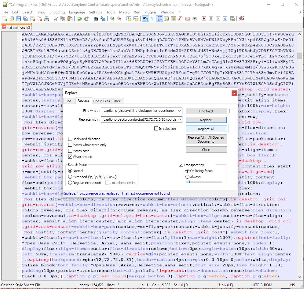
On a Windows system Storyline stores this information in three template files it writes from for Preview and Publishing. I use a free text editor called Notepad++ to open these, search for the default code I showed above in its minimized form, and replace it with the minimized code below.

Code to Find in all three files that follow:

.caption p{display:inline-block;pointer-events:none;padding:10px;text-shadow:-1px 0px black, 0px 1px black, 1px 0px black, 0px -1px black;color:#ffffff;border-radius:4px;background:#31373a;margin:0 0 10px 0;padding:10px;text-align:center;line-height:1.5}
  1. C:\Program Files (x86)\Articulate\360\Storyline\Content\dark-spider\unified\html5\lib\stylesheets\main.min.css
  2. C:\Program Files (x86)\Articulate\360\Storyline\player\unified\html5\lib\stylesheets\desktop.min.css
  3. C:\Program Files (x86)\Articulate\360\Storyline\player\unified\html5\lib\stylesheets\mobile.min.css

Code to Replace it with in files 1 & 2:

.captionp{background:rgba(72,72,72,0.81);border-radius:4px;margin:0 0 10px 0;color:white;display:inline-block;font-family:"OpenSans",Arial,Helvetica,sans-serif;font-size:28px;line-height:1.18;padding:10px;pointer-events:none;text-align:left !important;text-decoration:none;text-shadow:black 0 0 3px;}

Code to Replace it with in file 3:

.captionp{background:rgba(72,72,72,0.81);border-radius:4px;margin:0 0 10px 0;color:white;display:inline-block;font-family:"OpenSans",Arial,Helvetica,sans-serif;font-size:21px;line-height:1.18;padding:10px;pointer-events:none;text-align:left !important;text-decoration:none;text-shadow:black 0 0 3px;}

I choose Notepad++ for this because it keeps these files open, notifies me whenever they’re change after a Storyline update, and automatically relaunches itself with Administrator privileges if I forget to open it that way and try to save any of these to Program Files(x86).

One of the minimized CSS files, modified with Notepad++

If you’re nervous about testing this process out in the program templates, you can try it on a published module first. Depending on how recent your AS360 version is you’ll find main.min.css and/or desktop.min.css and mobile.min.css in
module-name - Storyline output\html5\lib\stylesheets

Summary of Part 2 and segue to Part 3

In Part 2 we explored the rationale for customizing the stock Storyline code, identified what’s possible with this particular software, revised the stock code, and saw where to place it so it’s in our previewed and published output.

Part 3 will look at Subtitle Edit, and how to set it up to speed up the process of creating quality closed captions for our learning modules. The DCMP site provides many examples of right and wrong choices for splitting lines other aspects of captioning and we won’t be able to discuss them all, but I’ll leave you with the basics and enough to take it forward from there. In the end you’ll be able to caption with Subtitle Edit, save the file in a suitable format, and import it into Storyline 360 using the relatively new Media Library.

Part 3 to follow soon. Thanks for reading!

§

Reference

1. Golombisky, Kim and Hagen, Rebecca (2017). White space is not your enemy : a beginner’s guide to communicating visually through graphic, web & multimedia design. Amsterdam ; Boston :Focal Press/Elsevier, 312pp.

Apr 10

Quality captioning in Storyline 360 — Part 1

Captions are for everyone

Captioning is the process of converting the audio content of a television broadcast, webcast, film, video, CD-ROM, DVD, live event, or other production into text and displaying the text on a screen or monitor. Captions not only display words as the textual equivalent of spoken dialogue or narration, but they also include speaker identification, sound effects, and music description. Captioning is critical for students who are deaf or hard of hearing, but it also aids the reading and literacy skills development of many others
The Described and Captioned Media Program

I work at an organization that advocates for inclusive design in all areas of society. It’s important to lead by example and so I strive for maximum accessibility in all our learning tools. I’ve led us to adopting high standards for closed captions, based mainly on the Described Media and Captioning Program (DCMP) captioning key, with some variations suggested by the Canadian Hearing Society’s Barrier Free Education Initiative and The Canadian Association of Broadcasters CC Standards and Protocol… August 2012 (PDF).

This post will be in three parts. Part 1 provides background. Part 2 will provide CSS code that approximates DCMP presentation guidelines for use in Articulate Storyline 360, and I’ll show you where you to put that code in AS360’s program templates folder so your quality captions appear automatically when you preview or publish a learning module using the AS360 desktop application, and Part 3 will present a tutorial on creating quality captions tuned to the DCMP’s guidelines using the free, open source editor Subtitle Edit,

A basic principle of inclusive design is designing for outliers. The Inclusive Design Research Centre says, “…Inclusive design should trigger a virtuous cycle of inclusion, leverage the ‘curb-cut effect’, and recognize the interconnectedness of users and systems.” The ‘curb-cut effect’ refers to the sloped cuts in the curb at intersections that were originally put in place for people in wheelchairs and that probably all of us sooner or later come to value.

And so it can be with closed captions — designed for the hearing impaired, they’re useful to anyone in a setting where for any reason it’s too hard to hear or, conversely, one wishes to enjoy video content but not to be heard. Presented also as “subtitles”, captioning is often vital to language learners and all those wishing to expand markets or impact diverse demographics.

The DCMP has studied this topic for over 20 years and more than anyone I can think of understands how the ‘curb-cut effect’ applies in this context. Perhaps the outliers among outliers are those with cognitive disabilities. To meet the needs of everyone quality captions contain each of the following elements. Quality captions are accurate—word-for-word, except in very specific circumstances I’ll discuss later—consistent, i.e., uniform in style and presentation, clear, representing the audio completely, identifying speakers and non-speech information, to provide clarity. They must be readable: displayed with enough time to be read completely, in sync with the audio, and neither obscured by nor obscuring the visual content. Equal access considers learners’ cognitive diversity, requiring that the meaning and intention of the material are completely preserved, not only in ways that benefit the hearing impaired.

Nonetheless, as with all forms of communication, one must always consider the audience. As an infamous (and fictitious) pirate of the Caribbean once said about a much different code, the finer details of quality captioning remain “…more what you’d call ‘guidelines‘ than actual rules” (Captain Jack Sparrow). In Part 2 I’ll summarize some key points I try to maintain in every case, discuss some instances where I might consider bending the rules, and describe some situations where one clearly must improvise. I’ll translate all that into a snippet of CSS code that works with the elearning software I use, Articulate Storyline 360 (AS360), and show you one way to make it work in AS360 so it’s applied in both previewed and published slides and persists between publications.

See you soon.

Part 2–>

§

Jun 25

Quick fix for poor screen reader support of title attribute

As someone who remembers when ARIA was just an idea, I’ve spent a fair amount of time adding title="something descriptive" to many of the links, images, and possibly other elements on web pages I’ve authored and edited. But as developers began relying on authentic users of assistive technology to test their work, and those with differing abilities brought their knowledge and experience into the discussion and onto the Web, we learned we were wrong. Some of us knew that early on, or part of it anyway, and in the paralysis that may sometimes grip those unsure what to do, I stopped using title for anchor tags (i.e. links; <a>) altogether.

ARIA’s all grown up now

ARIA grew up and became the specification. The bulk of screen readers put their support there, and aria-label="making this meaningful" has supplanted the title attribute, freeing it to be what it is.

There’s enough explanation about this on the Internet already, so I’m going to keep this one very short. There are a lot of links in my pages that are in various states that reflected my limited understanding at the time, and maybe in yours too—live and learn! As I’m mostly working with WordPress sites these days, and WordPress has built-in jQuery, I’m sharing this snippet of code that takes text from existing “titles” and places it in an aria-label, or takes the linked text displayed to the visitor and makes it a bit more friendly and conversational than the typical screen reader default: “Link text. Link”

Most of my WordPress sites have a js folder in the theme I’ve chosen’s main folder at …wp-content/themes/theme-name/js, and in it a file called functions.js. Below is a standalone jQuery closure that should work in any site that has jQuery installed. In practice I took the indented part, between the first and last lines, and pasted it below the existing scripts in the existing closure. In Drupal you might put it in …/sites/all/themes/theme-name/js (and load it with a preprocess.inc). If you’re not using a CMS you probably need to wrap it in <script></script> tags, and make sure you place it below the prerequisite jQuery include.

For the blog you’re reading now, which didn’t already have a functions.js file in place, rather than stuff it into another I placed the following line below wp_head(); in header.php, found in the WordPress root folder.

wp_enqueue_script( 'my-custom-functions', get_template_directory_uri() .'/js/functions.js' );

This quick fix should probably be considered a temporary one, but it sure makes my pages sound better with ChromeVox, so I’ll carry on and wait for experts like Geoff Collis and others to tell me what to do next.

(function($) {
  // If there's a title attribute, make sure it's copied to aria-label (for screenreaders)
  // If there's no title, elaborate on the linked text.
      var
        links = $('a')
      ;
      links.each(function(i){
      	if (this.title){
      		$(this).attr({'aria-label':this.title});
      	} else {
      		this.title="Go to " + $(this).text() + ".";
      		$(this).attr({'aria-label':this.title});
      	}
      });


})(jQuery);


Jan 28

WCAG 2.0 in a nutshell, and a problem that illustrates its use

The “Web Content Accessibility Guidelines” (WCAG) 2.0 are the accessibility standard most new websites in Ontario and many other places around the world have to meet nowadays. Here’s a front end accessibility lesson that can show us a few things about applying WCAG 2.0, at a couple different levels. I’ll demonstrate a JavaScript solution to a specific problem, I’ll sort of ‘reverse engineer’ from that problem to locate where it sits within the framework of the four principles—that content must be Perceivable, Operable, Understandable, and Robust—and I’ll show how I use the WCAG 2.0 site to understand any accessibility issue—whom it affects, how, how to fix it, and how to know that I’ve done so successfully. As a bonus, I’ll pop over to the jQuery API site and look at the selector reference. I think the WordPress “hack” I show for adding this to your blog is out of date—the “Admired” theme I’m using now has a way better built-in method—so you’ll need to adapt it. No clue at all what I’m talking about? I didn’t learn this in school either… sometimes you just have to dig in and figure it out.

Understanding WCAG 2.0

Understanding… WCAG 2.0 means understanding that the work began as a collaborative effort to define the 4 Principles of an accessible internet site, which after a decade of ongoing consultation with an ever-growing international community are now guidelines—not exactly the same as “rules”—and a list of criteria—things front-end developers must, should, and can do—to succeed at removing the barriers some groups will otherwise face when accessing and using the internet. [It…] is not prescriptive, but offers options…

Understanding how to use the huge body of work we call WCAG 2.0 means understanding that the work began as a collaborative effort to define the 4 Principles of an accessible internet site, which after a decade of ongoing consultation with an ever-growing international community are now guidelines—not exactly the same as “rules”—and a list of criteria—things front-end developers must, should, and can do—to succeed at removing the barriers some groups will otherwise face when accessing and using the internet. Because the list is not prescriptive, but offers options, it seems of the utmost importance to first know your audience, and next, to understand as the Web Consortium’s Accessibility Group sets out in WCAG 2.0, the best way your organization can guarantee your audience access to your content.

David Berman said in his workshop, and I think it makes perfect sense, that the differences between accessibility and usability are, for all intents and purposes, purely semantic. Providing access for people with varying abilities, simply makes things more usable for everyone.

The specific problems I’ll address are, ‘opening too many new windows’ and ‘changing things without telling me.’ In order to keep site visitors from leaving a site, Web developers often open links in new windows, usually by using the target attribute, and by assigning it a value of "_blank":


<a href="http://SOME_LINK" target="_blank">Linked text</a>

WCAG 2.0 in a nutshell

As I said earlier, there are 4 Principles. Websites must be 1) perceivable, 2) operable, 3) understandable, and 4) robust. If you like acronyms: POUR some accessibility sugar on me (use <abbr title="Spelled Out">SO</abbr> to create tool tips screen readers can use)! Each principal has “guidelines, “…which are further categorized into levels. Level A must be done, or some group will not be able to access the content. Level AA should be done, or some group will have difficulty accessing the content. Level AAA can be done to improve usability or enhance accessibility further. Too many windows causes problems in understanding, which is principle #3. This can be especially challenging for those with disabilities related to vision or cognition.

The Understanding WCAG 2.0 site provides information by which to understand each guideline, and provides “success criteria” so you know when you’ve achieved each level, and examples of techniques you can use to get there. “Success criteria” are written as statements that are recognizably/measurably false until one meets the guidelines. The problems that prevent the statement from being true are your challenges to overcome.

Know your organization, your audience, and your content. Use valid HTML wherever you write code. If most of your site visitors are knowledgeable about technology it may not be necessary to open new windows, as they will use their familiar browsing setup to choose when and how to open them, and if your code is valid it will work as they expect. There’s no WCAG 2.0 guideline that says not to open new windows, but we must think more carefully about how doing so may create barriers to ease of access and use.

Guideline 3.2 says: make webpages appear and operate in predictable ways. Opening pop-up windows could be problematic for screen readers. If they don’t know the window is opening they can get lost. This guideline also covers many situations, such as focus or context changes, and page reloads—anything a user can potentially do that changes the content. WCAG 2.0 by no means prohibit pop-up windows, but we must prevent them from becoming barriers or annoyances. We should minimize the number of new windows, stop using target=”_blank”, and let users request a new window or otherwise inform them it’s about to open. If we look further in the Table of Contents we find a discussion about pop-ups under 3.2.5, with suggestions…

Situation C: If the Web page uses pop-up windows:

Including pop-up windows using one of the following techniques:

H83: Using the target attribute to open a new window on user request and indicating this in link text (HTML)

SCR24: Using progressive enhancement to open new windows on user request (Scripting)

3.2.5 also has an “Advisory” about additional techniques.

Additional Techniques (Advisory) for 3.2.5

Although not required for conformance, the following additional techniques should be considered in order to make content more accessible. Not all techniques can be used or would be effective in all situations.

Opening new windows by providing normal hyperlinks without the target attribute (future link), because many user agents allow users to open links in another window or tab.

G200: Opening new windows and tabs from a link only when necessary

Understanding the problem, we now make a plan

Objective

I don’t want folk leaving my pages abruptly or permanently, and I don’t think all my visitors know everything about their browser’s and other equipment’s context-sensitive help menus, access key options, etc., so I’ve elected to automatically open some content in new windows. I’ve decided I can sensibly limit the number of windows that open from any of my blog pages to a maximum of 2 by applying a simple self-enforced rule. I’ll still use the target attribute, but instead to create one “named window” for links to other areas of my site (rcfWin), and one “named window” for links to external sites (extWin). I’ll open all external links in their own window, which means I can easily design something that will apply retroactively to all such links. Go to the API selectors page and scroll down to Attribute Starts With Selector [name^="value"] to get the syntax. I want to select all the links (a) with an href attribute whose value begins with http:// (or https://). We can get away with [href^="http"].

I have to weigh all the advice to find the best way to handle my internal links. If you’ve linked text in the middle of one article to another article there’s a distinct chance the user will click it and start reading. If you don’t want that, the most sensible choice is usually to lose the link—link only at the end of the information and only to the next logical jump in a sequence. But if you feel you must have the option, to keep it as an available option you can create a CSS class name and tell jQuery to look for that. You’ll still have to add it manually to any links, past present or future, you want to behave that way. Or you could do it the other way around and use your class to prevent opening in another window or tab.


<a class="open-in-rcfWin" href="/MY_INTERNAL_LINK" target="rcfWin">Linked text</a>
<a href="http://SOME_EXTERNAL_LINK" target="extWin">Linked text</a>

* Aside: I’ve already manually removed the http://www.rcfouchaux.ca from internal links because of its effect on WordPress “pingback links,” which I’ve got going on here. I’ll have to explain those later, but it comes in handy that I’ve done this, as you’ll soon see.

Problem

This blog just turned 3, and I’ve got a lot of blog pages. I have to find some way to automate at least some of this. I might have used target="_blank" sometimes, and not others. I might have already used target="extWin".

jQuery to the rescue!

jQuery library—write less, do more

jQuery is a “library” of code that makes standard JavaScript easier to use by preparing commonly used patterns and tasks and giving them logical, easier-to-remember names. jQuery selectors let’s us find and select specific elements and groups of elements on a web page and then manipulate them in pretty astonishing ways. If your site is WordPress like this one you’ll have to find out if jQuery is already included in your theme, or if it can be added easily (or if you have admin access to your web root and know how you can add it to any web site). Due to historical reasons I combine methods. I let the Admired Theme supply the jQuery and I keep extras in my own file. To make it use the scripts in my file I need admin-level server access to edit my theme’s header.php, which is found in wp-content/themes/YOUR_THEME/. Find wp_head(); alone on its own line and add a line of code after it wp_enqueue_script( ALIAS, PATHTOFILENAME );. The path to the file has to be complete, should be a ‘relative’ path, and depends on your server. I always make the alias the first part of the filename.

<?php
	/* JavaScript for threaded comments.
	 ----------------------------------*/
	if ( is_singular() && get_option( 'thread_comments' ) )
		wp_enqueue_script( 'comment-reply' );

	/* wp_head() before closing </head> tag.
	---------------------------------------*/
	wp_head();
	
	/* Include own script(s) AFTER wp_head() tag.
	---------------------------------------*/
wp_enqueue_script( 'MY_CUSTOM_SCRIPT', '../[actual_path_to]/MY_CUSTOM_SCRIPT.js' );
 
/* etc... */

Thereafter you make changes to that file and then replace it on the server. Keep in mind that header.php will be over-written if and when you update your theme, so keep backups of any code you add.

Adding the behaviors we want to the elements we want

The jQuery magic starts when you wrap the selector in $('SELECTOR');. I’ll be creating a set of extWinLinks $('[href^="http"]'); and rcfWinLinks $('.open-in-rcfWin');

There are nearly always more than one way to solve a problem with jQuery. My general approach will be to create a function as the page loads, and call it when the page is ready. I’ll supply more details in the code comments!

To recap: we’ll take all http links and assign target=”extWin” regardless if they’ve got a target attribute set or what it might be set to. We’ll also create a class name to apply to internal links we think should open their own window, but never the same window an external link may already be open in. Bonus: We’ll add the sentence ” … Opens in a new tab or window.” to every link that does that. Because this last bit of code will be repeated in both the previous functions we’ll write it as a standalone function in its own right, and call it from the other two when needed (those jQuery.each(); loops that repeat in each function are good candidates for the same treatment, but I left it so you can better compare what’s happening in each case).


        /*
         * Window openers
         * Require jQuery
         *
         */
          
          // Declare variables in a single statement at the top of the script.
          // Select external links and store in a variable named extWinLinks
          // Select internal links and store in a variable named rcfWinLinks
          // Create two functions to set the targets on the two sets of elements. 
          var
             extWinLinks = $('a[href^="http"]').not( 'a[href~=".rcfouchaux.ca/"]' ), // use a comma if you have more
             rcfWinLinks = $('.open-in-rcfWin'),
             do_extWinLinks = function() {
                 // Set the target attribute to 'extWin'
                 extWinLinks.attr({ target:'extWin' });
                 
                 // Go through each item and get its title if it has one, or set it to an empty string.
                 extWinLinks.each( function( el,i ) {
                     var my = $(this), myTitle = my.attr('title') || '' ;
                         my.attr({ title : appendNotice( myTitle ) });
                 });
             },
             do_rcfWinLinks = function() {          
                 // Set the target attribute to 'extWin'
                 rcfWinLinks.attr({ target:'rcfWin' });
                 
                 // Go through each item and get its title if it has one, or set it to an empty string.
                 rcfWinLinks.each( function( el,i ) {
                     var my = $(this), myTitle = my.attr('title') || '' ;
                         my.attr({ title : appendNotice( myTitle ) });
                 });
             },
             appendNotice = function( title ) {
                 // Store the notice as a variable
                 var
                     notice = ' … Opens in a new tab or window.'
                 ;
                 
                 // return the appended notice (but don't add a leading space)
                 // This syntax, if what's left of ? is true returns left of :, otherwise right of :
                 return ( title.length > 0 ) ? title + ' ' + notice : notice ;
             }
          ; // I make the final semicolon obvious so I can find it later
          
          // Call the functions. 
          do_extWinLinks(); 
          do_rcfWinLinks();  
  

To summarize

Know your organization, your audience, and your content. Use valid HTML wherever you write code. If most of your site visitors are knowledgeable about technology it may not be necessary to open new windows, as they will use their familiar browsing setup to choose when and how to open them, and if your code is valid it will work as they expect. There’s no WCAG 2.0 guideline that says not to open new windows, but we must think more carefully about how doing so may create barriers to ease of access and use. We might consider limiting their number—by using a named window, not the well-known keyword _blank—and warn our users it will open in a way that screen readers will discover and convey to any users who may be using one. This discussion follows a line of thinking you can adapt to meeting other WCAG 2.0 success criteria. This JavaScript shows only one way to reduce the number of windows your site opens, and to inform users in advance in a way their technology can understand.

I’ve coded all the external links in this post differently, but they should all open in the same tab or window. Hover your mouse over any links on this page to see if the ” … Opens in a new tab or window” notice worked. Here’s a class="open-in-rcfWin" internal link and here’s another one. The next one has no class set, so it will replace the content of this page with the home page: ciao for now!

§

Understanding WCAG 2.0 Latest version: www.w3.org/TR/UNDERSTANDING-WCAG20/

How to Meet WCAG 2.0 – Quick Reference: www.w3.org/WAI/WCAG20/quickref/

Dec 02

Some best practices for posting infographics?

As often happens when we go searching the web for something, I ended up with something else, and learned something different than I started out to learn. I was searching for statistics about social media. I soon discovered how pervasive infographics have become, even compared to six months ago. When done well they are clearly very good at presenting data quickly and coherently. But there are some other things I expect when I go searching for data, and they seem to be as easily overlooked as they could be to include, if only we take the extra couple minutes to consider. I believe I’ve also seen some hints that with infographics it may even be easier to misrepresent and distort data than with such well-known devices as bar graphs, and well understood yet often repeated practices such as moving the origin to influence scale.Infographic

UPDATE: Accessible Image Maps (below, under Presentation)

From Wikipedia:
Information graphics
or infographics are graphic visual representations of information, data or knowledge intended to present complex information quickly and clearly.[1][2] They can improve cognition by utilizing graphics to enhance the human visual system’s ability to see patterns and trends.[3][4] The process of creating infographics can be referred to as data visualization, information design, or information architecture.[2]

Infographics aren’t new. The article above links their origin to cave paintings. I remember posters in my doctor’s office in the 60s that fit the description. Neither myself nor most of the adults in the waiting room would have been likely to pick up a peer-reviewed journal or seek out the study that uncovered the data being presented. There would likely be some fine print in the corner that indicated who prepared it, and you could track it down if you were interested. In the information age and on the World Wide Web that would be both lazy and unacceptable. For end users with sight, graphic presentation of data on the Web may be even more effective in some cases.
Whether graphs are actually superior to tables—in business decision-making, for example—has been a bone of contention for some time (e.g., Davis, 1986:46-7). I would suggest that on the World Wide Web the ability to select, copy and paste the text in a tabular display would in many cases be more satisfactory to many end users than an attractive display that was perhaps not as portable.

File Format

One “solution,” or perhaps just a happy accident, is that many infographics are posted as PDF files1. These can support embedded links, can be downloaded and printed maintaining the integrity of the original (and its copyright notices, etc.) and in many cases support copy/paste. PDF files can be made accessible; that becomes a process that must be included in the development cycle. As I’m writing this, it should be noted, only certain WebKit browsers—Chrome, Konqueror (Linux) and Safari  (Mac only)—display PDF files without additional software. Native and open formats like PNG are more universal. In my opinion SVG is the one to watch. It’s a “vector” graphic format, which means it maintains quality at any size. Most newer browsers will display SVG, and the spec contains some very exciting abilities of the “coming soon” variety, such as zooming, timecode and animation, that should greatly enhance our ability to organize and communicate the meaning of data. In either case you should put references, links, and anything else your visitor may want to know that isn’t in the data itself in plain text in a caption underneath. If you’re on WordPress there’s a caption box in its standard image upload form you can use. Regardless of platform this should be relatively easy and may go a long way to advance the usability and usefulness of your data.

Data Obfuscation

Infographics may contain mixtures of several types of data display, including graphs and tables. All of the abilities to distort and misrepresent data, whether intentionally or not, are therefor multiplied. A prime example is this infographic released by the US Republican Party to convince their constituency why they believed the Affordable Care Act was a bad idea. A combination of  illogical colour use, bad layout, poor choice of fonts and font-size, meaningless relative proportions and little white space make the system it claims to represent look overly complex, and to many perhaps, even ugly.

Republicans Party version of a graphic purported to represent ACA flowchartOn the site where this lives commenter Nick Dobbing, founder and principal designer at Wovenland Systems in Vancouver points out, “Notice all the bright primary colours in the chart, all the many different shapes, with no sense or order in the way they’re used. No help to anyone sincerely trying to comprehend the diagram… but boy howdy, it sure makes it look more complicated! And that’s all that this diagram is about.” When other designers redid the graphic with a commitment to display the information with integrity  it looks quite different.
Citizen designer Robert Palmer's graphic representing ACA flowchart

I encourage you to read Robert Palmer’s

Open letter to Speaker John Boehner from citizen designer Robert Palmer of California infosthetics.com

I’ve included only the portions relevant to my discussion.

  • I have removed the label referring to “federal website guidelines” as those are not a specific requirement of the Health and Human Services department. They are part of the U.S. Code. I should know: I have to follow them.
  • I have relabeled the “Veterans Administration” to the “Department of Veterans’ Affairs.” The name change took effect in 1989.
  • In the one change I made specifically for clarity, I omitted the line connecting the IRS and Health and Human Services department labeled “Individual Tax Return Information.”

Robert Palmer
Resident,
California 53rd District

Presentation

Many sets of data may form lovely graphics that are nonetheless too large and complex to fit a single browser window. In my experience a popular solution is to make the graphic longer, not wider. This is in keeping with a standard web mantra that vertical scrolling is okay, horizontal scrolling is bad. I’ve read recent reports that scrolling is less a big deal to those who’ve grown up on the mobile web, and it’s easy to find designers who agree. I’m a centrist in this case, I much prefer to get what I came for front and centre, but I’ll adapt and go with the flow—if it’s clearly a flow, not an eddy.

Accessible image maps are also worth considering. At minimum you must use ALT tag in the main image, and later in each hot spot. (Penn State, 2012)

The future

Designers are still discovering new abilities within HTML5. A feature with many yet-to-be-tapped applications is the new data attribute that can be applied to any element. Source code for a legacy tag that displays an infographic image might look like (press letter M to widen)
<img src="path/to/infographic.png" alt="Description of image">;
we call img the element, src and alt are its attributes. We can now add custom attributes that begin with data- and retrieve them easily with JavaScript (and even more easily with jQuery). For example,
<img id="myInfographicWithDataAttributes"
  data-mySource="Fouchaux (unpublished manuscript), Answer to the Ultimate Question of Life, The Universe, and Everything"
  data-mySourceURL="http://not-in-our-lifetime.com" src="path/to/infographic.png" alt="Description of image">

You can create a new object and retrieve the value
myData = $('#myInfographicWithDataAttributes').data();
What you called data-mySource and data-mySourceURL are now available as myData.mySource; and myData.mySourceURL


Conclusion

I think I’m getting some ideas about possible best practices for posting infographics. Please use the comment section to critique my suggestions and to offer your own.

  1. The most useful format when the graphic contains links, references end users may want to paste into a Google search, or the document is to be printed or downloaded is PDF1. However, currently only WebKit-based browsers: Chrome, Konqueror (Linux) and Safari for Macintosh can display PDF without additional plugins, PDF files can be large, and they require extra care to assure accessibility.
  2. Unless I absolutely need my audience to download and print I’d be inclined to post a PNG (all browsers) or SVG (all newest browsers) image and include links, references and citations in a plain text caption underneath.
  3. Mayer’s principles of multimedia design, especially concerning coherence and spatial contiguity, apply. Good use of whitespace, a sensible colour scheme are key, but these are indicators of good design in any medium. Illogical colour use, bad layout, poor choice of fonts and font-size, can obscure, distort, and render meaningless any set of data.
  4. I’m personally not a fan of long, skinny and scrolling. Unless the data demands otherwise I’d try to keep all the information visible at once. If scrolling is necessary there’s still general agreement that it should be vertical.

Further reading

The United Nations Statistics Division Knowledgebase on Economic Statistics offers these Making Data Meaningful guides that are “…intended as a practical tool to help managers, statisticians and media relations officers in statistical organizations use text, tables, charts, maps and other devices to bring statistics to life for non-statisticians. […] The first guide provides guidelines and examples on the use of effective writing techniques to make data meaningful. The second guide provides guidelines and examples on preparing effective tables, charts and maps, and using other forms of visualizations to make data meaningful. It also offers advice on how to avoid bad or misleading visual presentations. The third guide aims to help producers of statistics find the best way to get their message across and to communicate effectively with the media. It contains suggestions, guidelines and examples.”

PENN State’s Image Maps in HTML explains image maps and how to make them accessible.

§


Notes

  1. Note that PDF (in strictly speaking) is not an image format, but a scriptable rich text document format that can contain different types of multimedia content, including vector and bitmap graphics, audio, video, forms, intra- and inter-document hypertext links and a hierarchical contents listing. You should handle accessibility outside the web browser before attaching your PDF.

Reference

Davis, Gordon B., Editor (1986) Understanding The Effectiveness of Computer Graphics for Decision Support-A Cumulative Experimental Approach, Communications of the ACM, Vol 29 (1) 40-47. [PDF]
Dugan, Lauren (2012) How Frequently Should You Tweet? [STATS] posted October 30, 2012 on AllTwitter The Unofficial Twitter Resource http://www.mediabistro.com/alltwitter/how-frequently-should-you-tweet-stats_b30568

Penn State (2012) Image Maps in HTML, http://accessibility.psu.edu/imagemaps, accessed 2012-12-02

Educase Learning Initiative (2012) http://net.educause.edu/ir/library/pdf/ELI7052.pdf

Aug 15

The current “state” of WAI-ARIA adoption and its “role” in accessibility

March 2014 UPDATE 2014: WAI-ARIA 1.0 is a completed W3C Recommendation as of March, 2014. Check current status

The WAI-ARIA project began in the fall of 2006. ARIA stands for “Accessible Rich Internet Applications,” by which it means web-based applications using CSS and JavaScript to change page elements without reloading the page. ARIA provides a means for the changes to communicate with assistive technologies.

“…I worked with a web project manager who was unfamiliar with ARIA, …and ended up interviewing half a dozen upcoming young developers, none of whom had heard of it either! Had the Web Accessibility Initiative’s initiative failed, …was ARIA D.O.A.?”

It came to my attention at that time due to my involvement with a group of teacher educators at the Faculty of Education at York U, Toronto. I admit I wasn’t able to make a great deal of sense of it until they published a Primer and a guide on Authoring Practice in 2010, and even so it remains daunting. Yet I believe in ARIA and what it’s trying to do, and I know of no other meaningful solution in the works. So I was disappointed and somewhat baffled when at my job in 2011 I worked with a web project manager who was unfamiliar with ARIA, and then, in the course of the project, ended up interviewing half a dozen upcoming young developers, none of whom had heard of it either! Had the Web Accessibility Initiative’s initiative failed, …was ARIA DOA?

Jutta Treviranus is Director and Professor at the Inclusive Design Institute at OCAD University. She’s explained at length the many challenges faced by people with differing abilities even if they’re using assistive technology, which involve availability, cost and compatibility issues far more convoluted than many of us may imagine. I recently had the chance to ask her some questions about ARIA adoption, and she’s graciously allowed me  to share her answers (and they let my colleagues off the hook!). Continue reading

Jan 10

ARIA adoption

Updated Problem mentioned her was fixed Nov 2013. …but I still can’t do the Show/Hide example here because the WordPress editor strips important attributes from <button> and <a> elements when you toggle from Visual to HTML mode. I got my Help rollovers working, though!Updated: see this post.

I don’t remember the details, but I stumbled upon the WAI-ARIA? project when it was a hatchling, and almost no one I knew had heard of it. It’s been over 2 years, the bird has left the nest, but it still seems to be flying under many people’s radar. It really should be an important piece in the designer’s repertoire. I’ve written about this at much greater length while I was doing an independent reading in Web Usability and Accessibility as part of my graduate studies. AJAX? messes with a web page’s “DOM”? in ways that are hidden from the user of the page by design. ARIA is meant to talk to assistive technologies and keep track of all such changes, communicating them to the software, or responding to custom designed hardware to do things those of us with so-called normal abilities take for granted. To do this, ARIA defines and then makes use of roles—e.g., this is a toolbar, this is a menu item; states—this panel is folded or invisible, this one is displayed; and properties—this menu has a drop-down, this one a pop-up.

Continue reading